I have been learning some programming for one of my new projects in my post-doc. The project involves analyzing 16S microbiome data, and in preparation, I learned unix command line, qiime, R, and python.
I wanted to post a project that I completed using python and R. I was able to do this completely from start to finish using the skills that I just learned, and I am very proud of it!
As background, I am now living in Los Angeles, and my husband is staying in Rancho Cucamonga, in the Inland Empire. I have been driving back to Rancho every Friday afternoon/evening to spend the weekend with my husband, and driving back to LA every Sunday night. This distance is approximately 60 miles, and takes approximately 1 hour door to door without any traffic. However the traffic in LA is constant and terrible, and it always seemed to be worst on Fridays when I was trying to head home. There were days when I was stuck in traffic for almost 4 hours. So I was interested in collecting traffic data for my particular commute (LA to Rancho) and the reverse commute (Rancho to LA). Of note, I live in Westwood, near the UCLA campus, so I need to drive right through the heart of LA to get out, which makes my traffic situation particularly bad.
First, I created a python script that uses urllib to import traffic data using the Google Maps API. I proveded the latitude/longitude for the points I wanted to obtain map data from (my apartment in Westwood, and our house in Rancho) to get driving distance between these two points. My script sends a urllib request (one for the commute and one for the reverse commute), and receives a response from Google Maps. The response is a JSON file that I then parsed to get the information that I wanted, in particular duration (Google provides duration in seconds), distance (provided in meters), and a "summary" for the trip provided by Google Maps. The JSON also has turn by turn directions available, but I did not collect this, as I thought it would have been difficult to analyze. So my python script pulled those pieces of data from Google Maps, performed a couple of calculations (convert seconds to minutes, convert meters to miles), then opens a csv file on my computer and appends the output to the csv file (one line for commute, one line for reverse commute).
I then created a cron job on my macbook to automate running the python script every 30 minutes, so I would get updated traffic data appended to my csv file every 30 minutes. Cron jobs only run when my computer is on and connected to the internet, so there is a significant amount of missing data, as I don't keep my laptop on all of the time. I later made a copy of my python script to run on our windows desktop at home, which is almost always on. And I set up a Windows Task Scheduler job to run on the desktop every 30 minutes (staggered from my laptop), so if both computers are on and running, you could presumably get 4 data points per hour, 15 min apart. I had some problems with windows and mac compatibility, and ended up making two separate csv files, one that my macbook appended to, and another that the windows desktop appended to.
I let the scripts run automatically for a few weeks to collect sufficient data. Below is my very messy python script. I have a lot of junk commented out from when I was messing around with it. But this code works for me, and is my first real python project.
import urllib.request
import json
from datetime import datetime
import csv
from os import system
import os
import time

ymd = datetime.now().strftime('%Y-%m-%d')
hms = datetime.now().strftime('%H:%M:%S')
day = datetime.now().strftime('%A')

# LA to Rancho

# Google Maps API URL
LA_api_url = 'https://maps.googleapis.com/maps/api/directions/json?origin=34.060675,-118.441184&destination=34.117704,-117.548024&departure_time=now&key=AIzaSyCgefVFOWLWzW4K6BngQoQgdWELwm2SlBI' # Get JSON data from Google Maps API
LA_response = urllib.request.urlopen(LA_api_url)
LA_data = json.load(LA_response)

# Get current duration of trip
LA_duration = (LA_data['routes'][0]['legs'][0]['duration_in_traffic']['value'])
# Get distance of trip (meters)
LA_dist_m = (LA_data['routes'][0]['legs'][0]['distance']['value'])
#  Get current summary name for trip
LA_desc = (LA_data['routes'][0]['summary'])

# Perform distance calculations (convert to miles)
LA_dist = round(LA_dist_m/1609.344, 2)

# Perform Time Calculations

LA_dur_min = int(LA_duration/60) #convert seconds to minutes
LA_dur_hour = int(LA_dur_min/60) #convert minutes to decimal number of hours
LA_dur_hm = LA_dur_min % 60 #convert hours to hours and minutes


# Rancho to LA

# Google Maps API URL
R_api_url = 'https://maps.googleapis.com/maps/api/directions/json?origin=34.117704,-117.548024&destination=34.060675,-118.441184&departure_time=now&key=AIzaSyCgefVFOWLWzW4K6BngQoQgdWELwm2SlBI' # Get JSON data from Google Maps API
R_response = urllib.request.urlopen(R_api_url)
R_data = json.load(R_response)

# Get current duration of trip
R_duration = (R_data['routes'][0]['legs'][0]['duration_in_traffic']['value'])
# Get distance of trip (meters)
R_dist_m = (R_data['routes'][0]['legs'][0]['distance']['value'])
#  Get current summary name for trip
R_desc = (R_data['routes'][0]['summary'])

# Perform distance calculations (convert to miles)
R_dist = round(R_dist_m/1609.344, 2)

# Perform Time Calculations
R_dur_min = int(R_duration/60) #convert seconds to minutes
R_dur_hour = int(R_dur_min/60) #convert minutes to decimal number of hours
R_dur_hm = R_dur_min % 60 #convert hours to hours and minutes


# Output
LA = ["LA to Rancho", ymd, hms, day, LA_desc, LA_duration, LA_dur_min, LA_dist]
R = ["Rancho to LA", ymd, hms, day, R_desc, R_duration, R_dur_min, R_dist]

#print(LA)
#print(R)

#print(LA_data)
#print(LA_duration)
#print(LA_desc)
#print(R_data)


with open(r"C:\Users\Oscar\Google Drive\Michel\Programming\Exercises\PycharmProjects\Traffic monitor\Traffic_Monitor_windows.csv", "a") as traffic_monitor:
    writer=csv.writer(traffic_monitor, delimiter = ",", lineterminator = '\n')
    writer.writerow(LA)
    writer.writerow(R)
    traffic_monitor.close()

# mac/linux
# /usr/local/bin/python3 "/Users/sun.m/Google Drive/Michel/Programming/Exercises/PycharmProjects/Traffic monitor/Traffic Monitor_3_4_combined.py"

# windows desktop
# C:\Users\Oscar\AppData\Local\Programs\Python\Python36-32\python.exe
# "C:\Users\Oscar\Google Drive\Michel\Programming\Exercises\PycharmProjects\Traffic monitor\Traffic Monitor_3_4_combined_windows.py"
Once I had enough data in my two csv files, I brought the data into R. I had actually learned R before I learned Python, and I like using ggplot2 to graph in R. I haven't really tried graphing in Python yet.
So in R, I imported my two csv files and used bind_rows() to get one complete dataframe.
There was a little data wrangling, including adding column headers, making the Days of the week factors, converting dates and times, and removing rows with all NAs. I had the most trouble with date time conversions. For some reason the macbook seems to have saved the dates and times differently than the windows desktop. After all of that, I was able to start plotting.
library(tidyverse)
library(TTR)
library(lubridate)

traffic1 <- read_csv("~/Google Drive/Michel/Programming/Exercises/PycharmProjects/Traffic monitor/Traffic_monitor.csv", col_names=FALSE)
traffic2 <- read_csv("~/Google Drive/Michel/Programming/Exercises/PycharmProjects/Traffic monitor/Traffic_monitor_windows.csv", col_names=FALSE)

traffic_all <- bind_rows(traffic1, traffic2)
colnames(traffic_all) <- c("Direction", "Date", "Time", "Day", "Route_Summary", "Seconds", "Minutes", "Miles")
traffic_all$Day <- factor(traffic_all$Day, levels= c("Sunday", "Monday", "Tuesday", "Wednesday", "Thursday", "Friday", "Saturday"))
traffic_all$Route_Summary <- factor(traffic_all$Route_Summary)

# converting dates and times
mdy <- mdy(traffic_all$Date)
ymd <- ymd(traffic_all$Date)
mdy[is.na(mdy)] <- ymd[is.na(mdy)] # some dates are ambiguous, here we give
traffic_all$Date <- mdy        # mdy precedence over ymd

#traffic_all$Time <- hms(traffic_all$Time)

# remove NA rows
traffic_all <- drop_na(traffic_all, Minutes)

summary(traffic_all)
This first plot is just geom_point scatterplot of date vs minutes in traffic. I wanted to point out that due to the nature of the cron job collection, there are missing points (the computer was not on at all times). I did not set up the script on the windows desktop until a few weeks into the project, and the desktop actually had a period of about 2 weeks where it was not connected to the internet and did not collect data. There are a couple of weeks of missing data in the end of April/beginning of May where I was at a conference in Hawaii, and no data was collected. Unfortunately, there is a disproportonately low data collection rate for Friday afternoons, as that is when I am normally driving home, and my computer is not connected to the internet at that time. But there is enough data I think to make some conclusions. Perhaps I will revisit this again in a few months when I have more data to make sure the trends hold true.

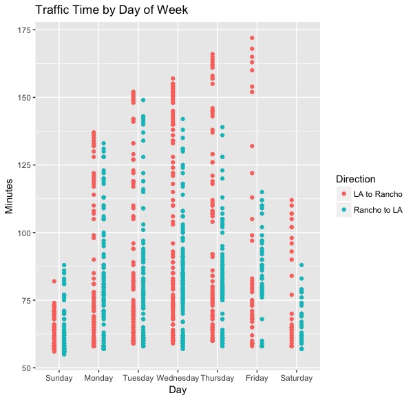
This next graph is traffic by day of the week. I suspected that there would be a trend for more traffic on Fridays, as I always seemed to be stuck in a lot of traffic driving home. Here, I've split up the LA to Rancho commute and the reverse Rancho to LA commute. It is clear that for LA to Rancho there is a trend towards increasing length of commute from Mon to Fri, with Friday begin the longest commute. There seems to be a very interesting difference between the LA to Rancho and Rancho to LA on Fridays in particular. As expected, traffic seems to be very low in both directions on Sunday, and higher on Saturday, but still not as high as the weekdays. I do want to note that because the cron and task scheduler jobs run overnight as well, we get a disproportionate amount of low traffic values (low limit of about 60 min) in the middle of the night.
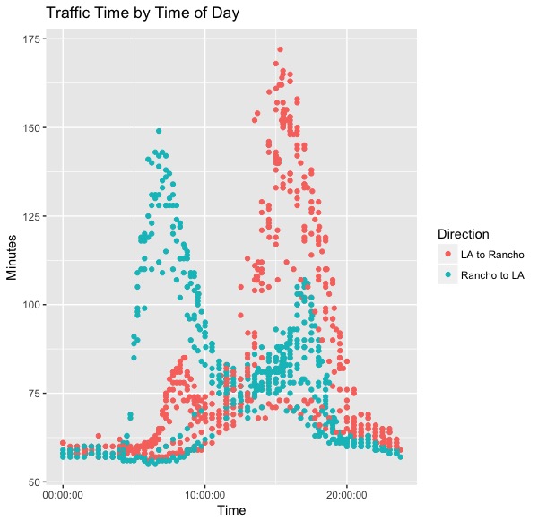
This next graph is one of the most interesting. This shows traffic by time of day for the two commute directions. Rancho to LA has a busy morning commute and smaller bump in the evening commute. LA to rancho has a tiny bump in the mornign commute and Huge evening commute, which is all as expected, since typically people live in the suburbs and work in the city. This graph also clearly demonstrates that the commute in the LA to Rancho direction is longer than the reverse direction. This also shows that there is a very small window of time if you are trying to drive around LA without getting stuck in traffic, maybe between 10am and 12am. (note to self, should increase the number of tick marks on the time axis)
The next two graphs separate out the LA to Rancho and Rancho to LA commutes, then looks at each commute direction by day of the week. There are interesting day of the week trends to be seen here. In the LA to Rancho direction, traffic is low on Sunday, and higher on Saturday. Weekdays have highest traffic, with traffic steadily increasing from Monday to Friday, with Friday having the worst traffic of the week. I wonder why this steady increase from Monday to Friday?

This is the same analysis but for the Rancho to LA commute. Again, low traffic on Sunday and Saturday, with not as great a difference betwen the two weekends as in LA. The weekend traffic is also in the afternoons, rather than early morning. The traffic on the weekdays starts around 5am. Interestingly, Friday traffic is actually lower in the Rancho to LA direction, and there is not as much difference between Monday through Thursday traffic. Perhaps on Fridays everyone is heading away from the city, and not into the city. The morning rush is worse than the afternoon rush in this direction.

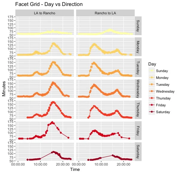
Here I present the data from the previous two graphs, but in a facet grid format! I am very proud of this facet grid. This is the first time I've found a use for a facet grid outside of a tutorial! You can clearly see the trends I discussed earlier here. I think this format shows a little better the fact that Friday traffic from LA to Rancho clearly starts a little earlier than the rest of the week.
Here is the fact grid data in a different orientation. This shows better the fact that the peak traffic in the LA to Rancho direction increases steadily from Monday to Friday. Whereas the peak weekday traffic in the Rancho to LA direction actually appears to be lowest on Friday.

Here I am plotting minutes in traffic vs miles traveled. This shows that there is really no correlation between time in traffic in miles. You are not spending more time in traffic because you are driving more miles. And Google is not rerouting you to longer distance commutes to avoid traffic. Likely because the traffic simply cannot be avoided here. Interestingly, the miles traveled is surprisingly consistent, between 60 and 65 miles no matter what route Google tells you to take.

This is a facet grid of minutes vs miles, basically the same information as the previous graph. Although I like facets, this one does not provide much additional information.

I had parsed the "summary" data from the Google Maps JSON. This is supposed to be a one or two route summary statement of the route that Google requests you take. I thought this would be interesting to see if Google reroutes you to different highways under different traffic conditions. However, the main highway from LA to Rancho is 210, and almost all of the "summary" statements just said to go on 210. I'm honestly not sure what the difference between CA-210 and I-210 E are, but they are given different labels from the Google Maps API. Probably it would have been more informative to find out which of the smaller highways Google would have routed us on (eg 405, 101, etc). I would have to look at the way the highway routes are labeled to get more information out of this.

Route summary from Rancho to LA. Again, I need to look up the difference between CA-210 and I-210 to determine what this graph is reporting. I think there is data here that could be interesting, but I don't know yet.

So there's a lot more data that I'm collecting through my Traffic Monitor. I'm going to keep the cron jobs going and see if I can get more data for more time points.
Some things I was thinking of looking into - maybe see if there is a relationship between traffic time and weather (eg more traffic when it is raining). Maybe look at traffic for other cities or other locations. I'm going to try to do some other projects to practice my python and R skills while I can.
Below I have listed the R code for each of the plots that I tried. Some I may not have displayed in this post. I plotted everything using ggplot2.
Thank you very much for reading!
# by date
traffic_all %>%
  ggplot(aes(x=Date, y=Minutes, col=Direction))+
    geom_point()

# by day of week - mean bar graph
traffic_all %>%
  ggplot(aes(x=Day, y=Minutes, fill=Direction))+
    geom_bar(stat="summary", fun.y="mean", position="dodge")

# by day of week - points
traffic_all %>%
  ggplot(aes(x=Day, y=Minutes, col=Direction))+
  geom_point(position = position_dodge(width=0.5))+
  ggtitle("Traffic Time by Day of Week")


# by time
traffic_all %>%
  ggplot(aes(x=Time, y=Minutes, col=Direction))+
    geom_point()+
  ggtitle("Traffic Time by Time of Day")

# friday only by time
traffic_all %>%
  group_by(Direction) %>%
  filter(Day== "Friday") %>%
  ggplot(aes(x=Time, y=Minutes, col=Direction))+
    geom_point()+
    ggtitle("Friday Commute")


# day of week by time, LA to Rancho
traffic_all %>%
  filter(traffic_all$Direction == "LA to Rancho") %>%
  ggplot(aes(x=Time, y=Minutes, col=Day))+
    scale_color_brewer(palette = "YlOrRd")+
    geom_point()+
    geom_line()+
   # geom_smooth(se=F)+
    ggtitle("Traffic by time of day - LA to Rancho")

   # scale_x_time(breaks=c(00:00:00, 06:00:00, 12:00:00, 18:00:00, 24:00:00), minor_breaks = waiver())


# day of week by time, Rancho to LA
traffic_all %>%
  filter(traffic_all$Direction == "Rancho to LA") %>%
  ggplot(aes(x=Time, y=Minutes, col=Day))+
  scale_color_brewer(palette = "YlOrRd")+
  geom_point()+
  geom_line()+
 # geom_smooth(se=F)+
  ggtitle("Traffic by time of day - Rancho to LA")


# Facet Grid - Day vs Direction
traffic_all %>%
  ggplot(aes(x=Time, y=Minutes, col=Day))+
  scale_color_brewer(palette = "YlOrRd")+
  geom_point()+
  geom_line()+
  facet_grid(Day~Direction)+
  ggtitle("Facet Grid - Day vs Direction")

# Facet Grid - Direction vs Day
traffic_all %>%
  ggplot(aes(x=Time, y=Minutes, col=Day))+
  scale_color_brewer(palette = "YlOrRd")+
  geom_point()+
  geom_line()+
  facet_grid(Direction~Day)+
  ggtitle("Facet Grid - Direction vs Day")+
  theme(legend.position="bottom")

# Facet Grid - Minutes vs Miles
  traffic_all %>%
    ggplot(aes(x=Minutes, y=Miles, col=Day))+
    scale_color_brewer(palette = "YlOrRd")+
    geom_point()+
    geom_line()+
    facet_grid(Day~Direction)+
  ggtitle("Facet Grid - Minutes vs Miles")


# Minutes vs Miles
  traffic_all %>%
    ggplot(aes(x=Minutes, y=Miles, col=Direction))+
    geom_point()+
    geom_line()+
    ggtitle("Minutes vs Miles")


# Route Summary - LA to Rancho
traffic_all %>%
  filter(traffic_all$Direction == "LA to Rancho") %>%
  ggplot(aes(x="", y=Minutes, fill=Route_Summary))+
  geom_bar(stat="identity")+
  coord_polar("y", start=0)+
  ggtitle("Route Summary - LA to Rancho")


# Route Summary - Rancho to LA
  traffic_all %>%
    filter(traffic_all$Direction == "Rancho to LA") %>%
    ggplot(aes(x="", y=Minutes, fill=Route_Summary))+
    geom_bar(stat="identity")+
    coord_polar("y", start=0)+
  ggtitle("Route Summary - Rancho to LA")


# Facet Grid - Route Summary
  traffic_all %>%
    ggplot(aes(x="", y=Minutes, fill=Route_Summary))+
    geom_bar(stat="identity")+
    coord_polar("y", start=0)+
    facet_grid(Day~Direction)+
    ggtitle("Facet Grid - Route Summary")